


Based on the recent release of the Federal Reserve, the net worth of households and nonprofits rose to $82.9 trillion during the fourth quarter of 2014. This is an increase of $4 trillion from one year ago and $26 trillion compared to the lowest net worth level in 2008. But how is this net worth distributed by U.S. households at the local level?
In 2013, the national median inflation-adjusted family net worth - the difference between families’ gross assets and their liabilities – increased only in the upper - middle income tiers of households (the top 40 percentile of income) compared to 2010. This increase eased the net worth gap between the top 10 percentile income tier and the top 20 percentile from 4.2 to 3.8 multiples. The gap narrowed also with the top 30-40 percentile income tier from 9.3 to 7.1 multiples. In contrast, the net worth gap increased between the top 10 percentile income tier and the middle, middle - low income tiers. For example, the gap widened between the top 10 percentile and the middle - low income group (top 60-80 percentile) from 46.7 to 50.5 multiples.
Real estate markets, which contribute the value of property to net worth, slowly began to recover from 2010. Specifically, home prices rose in 84% of the 100 largest metro areas. Data show that homeowners have steadily recovered and built housing wealth[1] as a result.
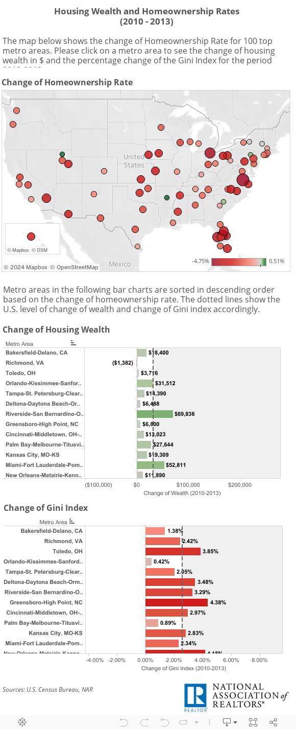
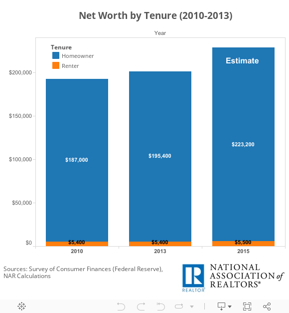
However, the homeownership rate declined in 93% of those metro areas. Hence, the rising housing wealth goes to fewer people as the number of homeowners has fallen while the number of renters has risen. Based on Federal Reserve data, the typical homeowner’s net worth in 2013 was 36 times greater than that of renters. Here is the net worth for Homeowners and Renters for the period 2010 – 2015 estimate.
Although it is difficult to assess the true level of wealth inequality in markets at the metro level, inequality can easily be identified as intensifying or lessening by simply measuring the change in the number of owners and renters at a time when values are rising. Analyzing Census data, Bakersfield, Richmond, Toledo, Orlando and Tampa were found to have experienced the largest decline in homeownership rate among the 100 metro areas. For instance, based on the table above, a typical homeowner in Orlando gained $31,500 in housing wealth from 2010. However, the homeownership rate in Orlando declined by 4.3%. This means that fewer people received that housing wealth increase to their net worth. Therefore, it is easy to infer that Orlando has become more unequal as the number of homeowners has fallen.
The inability for renter households to become homeowners is leaving them behind financially. A typical homeowner’s net worth climbs because of upticks in home values and declining mortgage balances over time. On the other hand, renters have likely seen increased housing costs and are less likely to have been active investors in the stock market’s strong growth in recent years.
Additionally, most metro areas also showed intensifying income inequality. While both are important to understanding inequality, wealth is different from household income. Wealth is the difference between the value of a family’s assets (money in bank account, value in property, etc.) and liabilities (debts). On the other hand, household income measures the annual inflow of wages, interests, profits and other sources of earnings. Income inequality is measured by the Gini Index[2] (U.S. Census Bureau). Data showed that most of the metro areas with high Gini index had also low homeownership rates (Los Angeles, New York, San Francisco, San Diego). Based on the negative relationship of wealth inequality and the homeownership rate above, it seems that those metro areas with higher income inequality were also associated with greater wealth inequality.
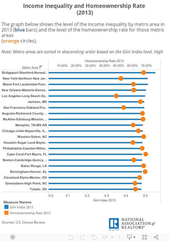
According to the visualization above, Los Angeles, New York, Fresno (CA), San Diego and San Francisco can be inferred to have the most unequal wealth distribution as a result of their low homeownership rates.
According to the visualization above, Los Angeles, New York, Fresno (CA), San Diego and San Francisco can be inferred to have the most unequal wealth distribution as a result of their low homeownership rates.
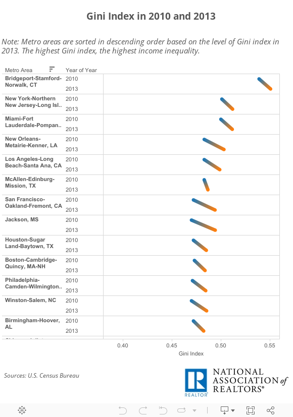
Comparing the Gini index level between 2010 and 2013, data also show that 93 out of the top 100 metro areas experienced a rising Gini Index, which also means rising income inequality. Bridgeport (CT), New York, Miami, New Orleans and Los Angeles were found to have the highest income inequality in 2013.
Based on the above analysis, the decline in homeownership appears to have serious implications for our economy and is currently leading to a more unequal America. Although better economic conditions should eventually open the door for more prospective buyers, improving access to mortgage products to creditworthy borrowers and ramping up new home construction – especially to entry-level buyers – will help ensure the opportunity is there for more American households to enjoy the potential wealth benefits and long-term stability homeownership provides.
Here are the tables of the study: Table 1-Changes Table-2-Levels
[1] The Change of Wealth includes the change in median home prices for single family homes (2010 - 2013) and an estimate of principal accumulated. Principal is estimated using a 30 - year mortgage and assuming that the homebuyer finances 80% of a median - priced home.
[2] Gini Index measures the extent to which the distribution of income among households within an area deviates from the perfectly equal distribution. A Gini index of 0 represents perfect equality, where all households have equal income. A value of 1 implies perfect inequality, where only one household has any income. Thus, the higher the Gini index, the higher income inequality in the metro area. Similarly, the higher the positive change in Gini index, the more income inequality has increased in the metro area. Areas with negative change in Gini index have seen income inequality decline.
